 |
|
Design for Print |
Transport Guides |
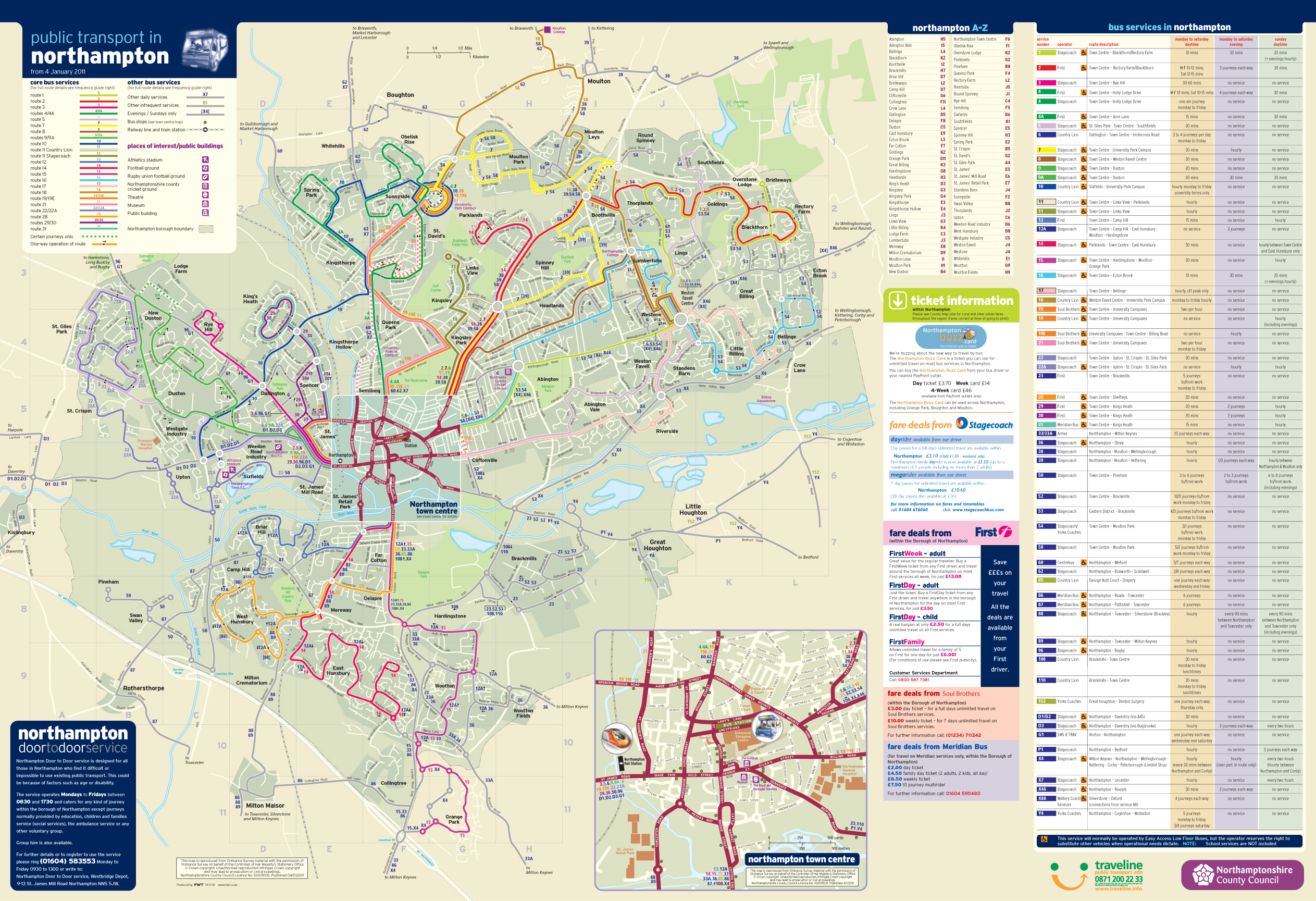
This Northampton guide is on an A1 space and has to incorporate a town map of transport data and also service information of the buses. Multiple types of data that need to sit next to each other and again, get the information across to the user. Straight, tabular layout makes this easy on the eye. Click on the thumbnails below for enlarged images. |
|
Bus Station Posters |
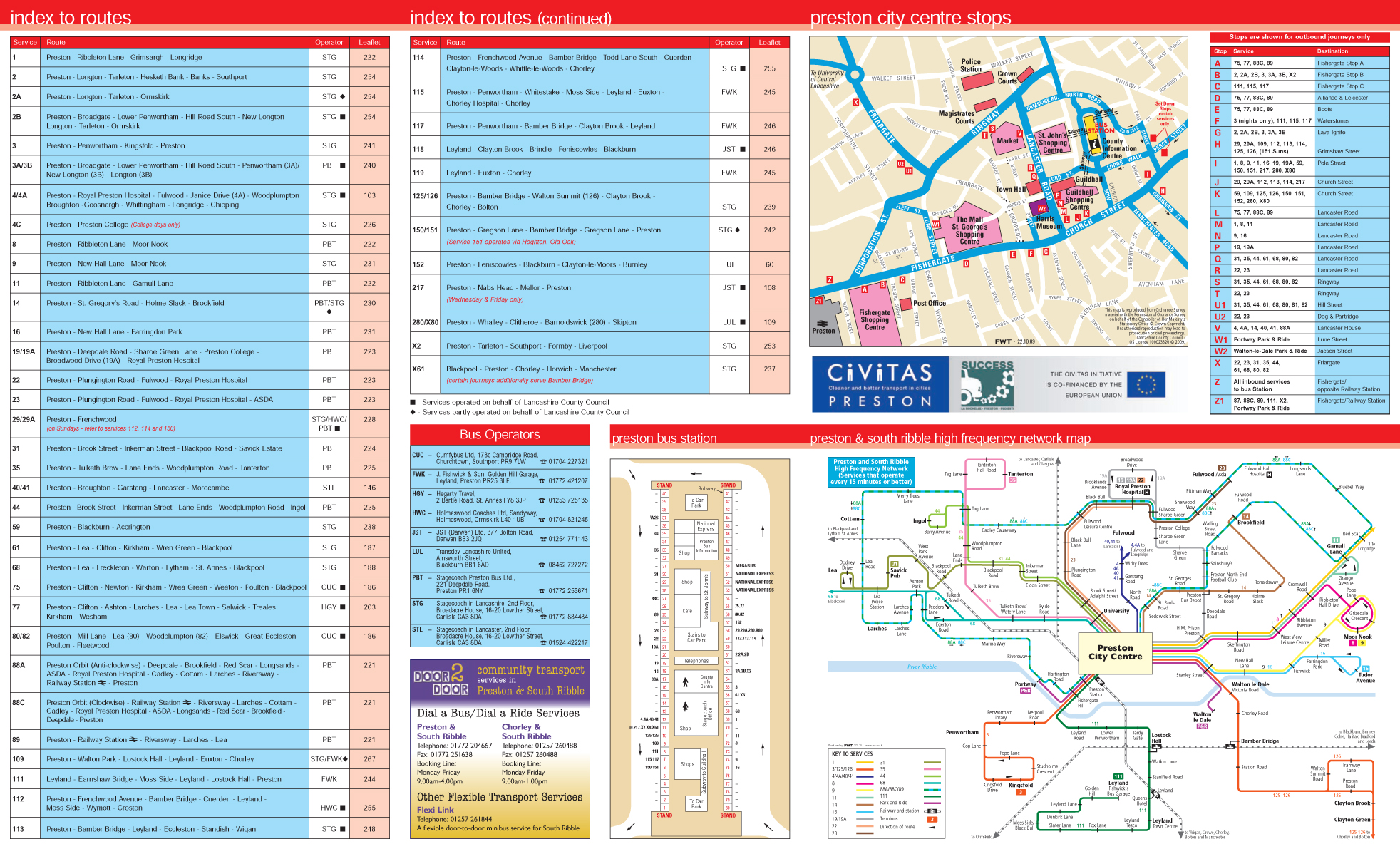
This Preston Bus Poster uses only brand colours and again lays out the information in a very grid like structure. The tables are therefore easy to read thus delivering the data to the user effectively. This was again part of a series of guides that covered the Lancashire County area. Click on the thumbnails below for enlarged images. |
|
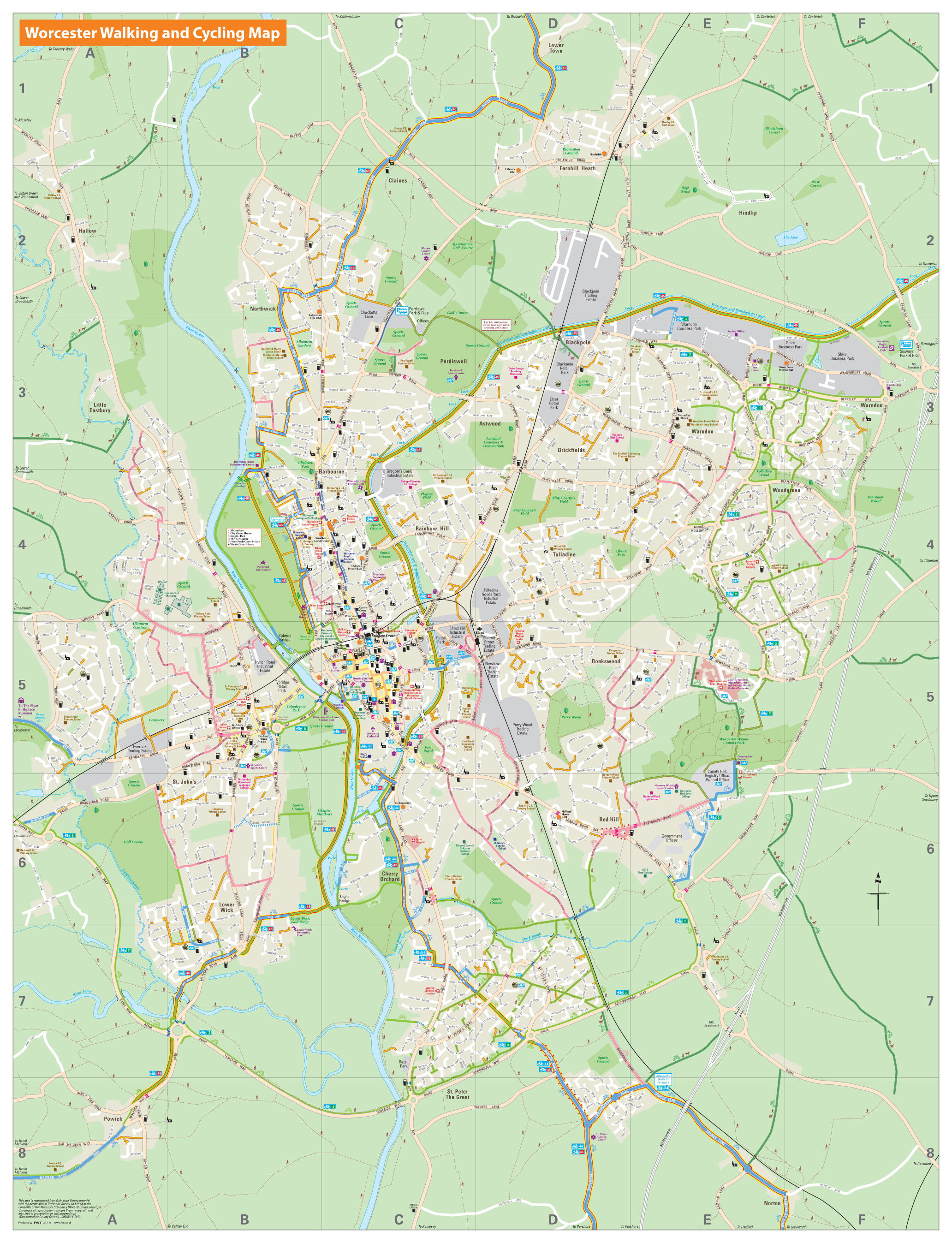
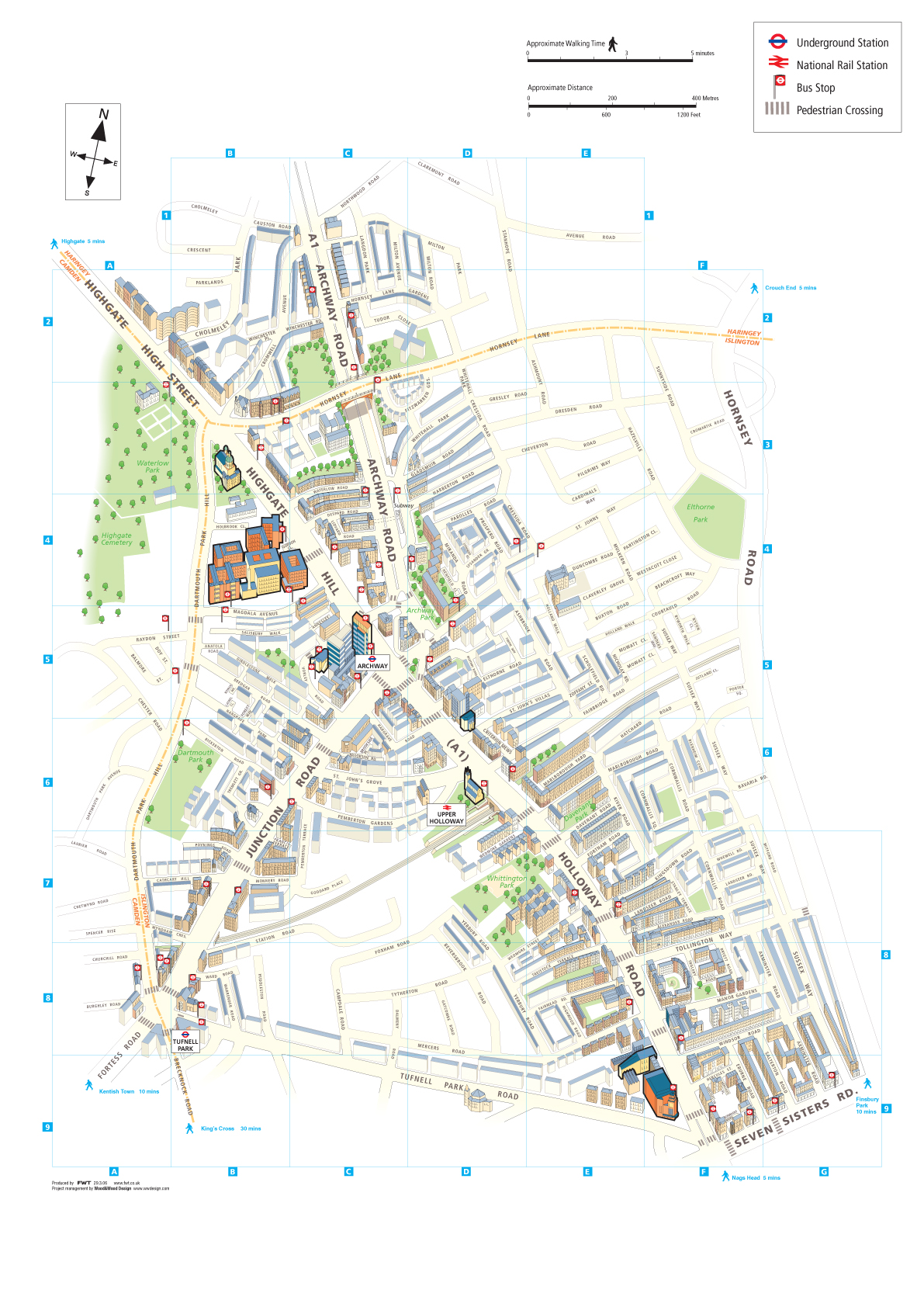
Walking, Cycling and Wayfinding Maps |
This 'Wayfinding' map centered around Archway in London was produced to give the walker a clear idea of where they are and how to get where they want to be. Wayfinding is now found not only in transport hubs, but also in the street, making the movement from A to B, whether by public transport or foot, easier. These Wayfinding maps can be drawn with north at the base or sides of the map so as to aid travel in a southward or east/west direction respectively. Click on the thumbnails below for enlarged images. |
|
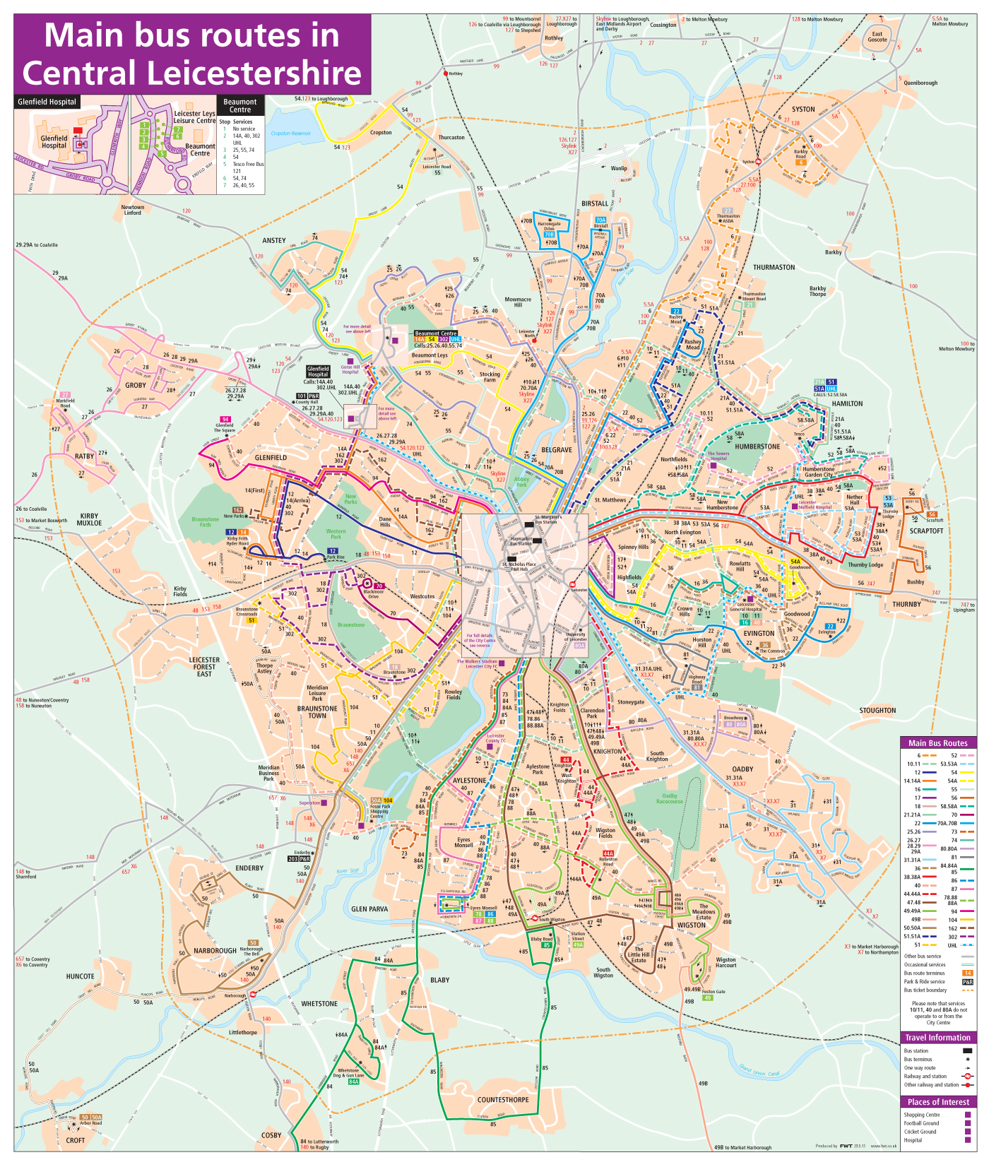
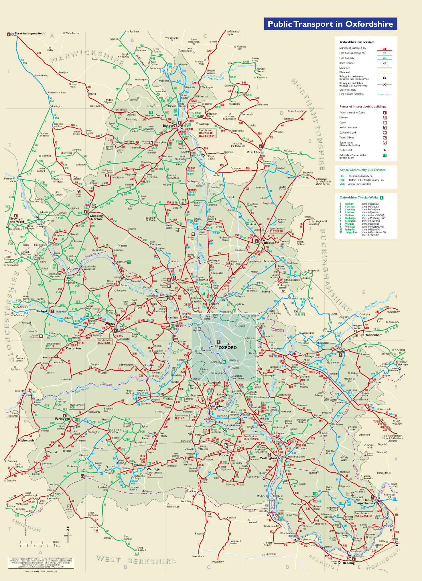
Bus Service Maps |
This is Oxfordshire County bus map is one of a series of county maps portraying the frequency of transport services throughout the county. It utilises primary colours to show high and low frequency so the difference is very clear. Town stamps, places of interest and a little geography combines to enhance and complete the map. Click on the thumbnails below for enlarged images. |
|
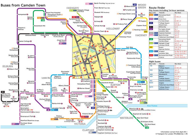
Bus 'Spider' and Rail Maps |
This Oyster Rail Services map was redesigned from an existing Transport for London product. The new map shows services by rail operating company, combined with the tube, overground and DLR services. Adding simple dashes to the rail network linework gives a clear distinction between the two types of service, the tube, overground and DLR being plain. The balance, flow and overall aesthetics of the map were also enhanced in the redesign. Click on the thumbnails below for enlarged images. |
|